By Christoph Büchner
Before a guest takes their first bite, their brain has already formed expectations. Colour is one of the strongest stimuli in the perception of food. It influences our assessment of freshness, ripeness, quality, intensity and even the presumed flavour.
For the catering industry, this means that taste does not begin on the tongue. It begins with the first glance at the plate.
The language of colours on the plate
Green
Green stands for: freshness, naturalness, health, herbs, vegetables and lightness.
Green dishes are often perceived as fresher, lighter and healthier. At the same time, guests often expect a certain acidity or herbal aroma from green ingredients. The colour conveys naturalness and a direct connection to nature.
Typical ingredients: Herbs – Spinach – Avocado – Lime – Green apple – Salads
Impact in the catering industry
Green is ideal for visually conveying freshness and lightness on the plate. The colour is particularly significant in modern, plant-based cuisine.
—
Yellow
Yellow stands for: the sun, freshness, citrus, lightness and joie de vivre.
Yellow dishes are often associated with fruitiness and freshness. Guests often expect yellow ingredients to offer a lively acidity and a fresh flavour. The colour comes across as friendly and approachable.
Typical ingredients: Lemon – Pineapple – Maize – Saffron – Banana
Effect in the catering industry
Yellow brings brightness and freshness to the plate. It is particularly well suited to accentuating light dishes and summery compositions.
—
Red
Red stands for: sweetness, ripeness, fruitiness, energy and enjoyment.
Red has the strongest association with the perception of sweetness. Many people automatically associate red foods with ripe fruit and intense flavours.
Typical products: Strawberry – Raspberry – Cherry – Tomato – Red pepper
Effect in the catering industry
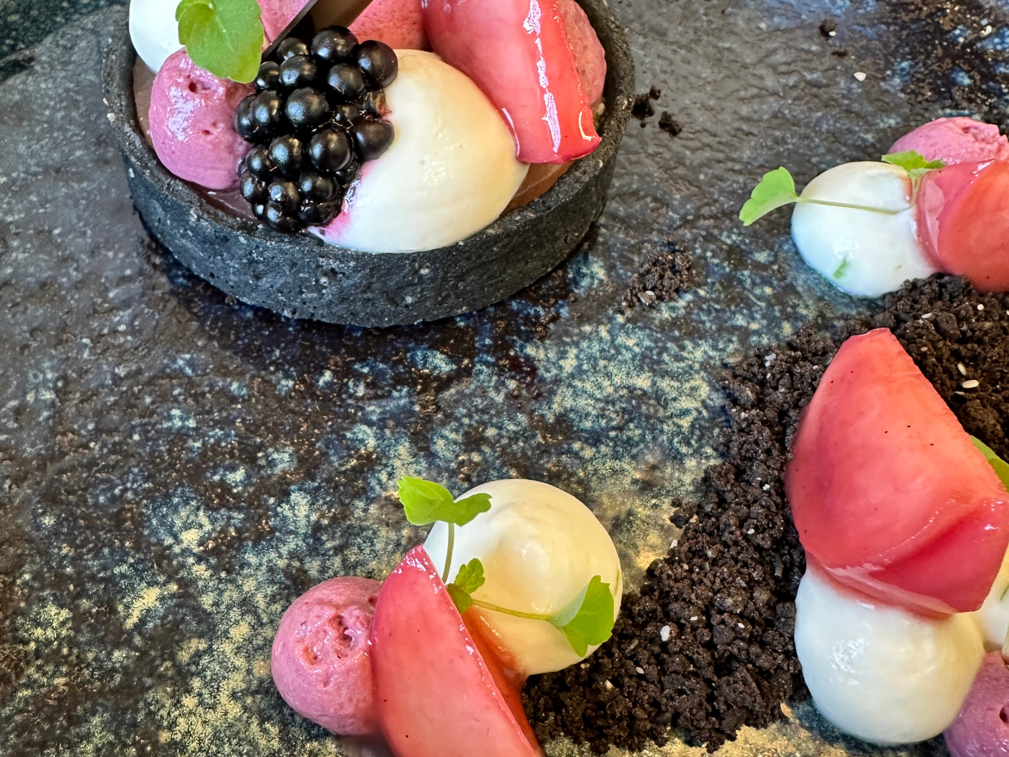
Red attracts attention and stimulates the appetite. This colour is therefore frequently found in desserts, fruit-based dishes and indulgent treats.
—
Brown
Brown symbolises: roasted flavours, craftsmanship, warmth, comfort and satiety.
Brown hues are reminiscent of bread crusts, chocolate, coffee and caramelised surfaces. They convey depth and artisanal quality.
Typical products: Bread – Chocolate – Coffee – Roasted meat – Nuts – Caramel
Effect in the catering industry
Brown inspires trust and authenticity. A perfectly caramelised surface is often considered to be of higher quality in terms of flavour than a pale dish.
—
Black
Black symbolises: intensity, exclusivity, elegance, power and modernity.
Black is an extraordinary food colouring and therefore attracts attention. The colour often conveys depth, complexity and a certain sense of luxury.
Typical products: Black garlic – Dark chocolate – Liquorice – Cuttlefish ink
Impact in the catering industry
In upmarket restaurants, black is used deliberately to convey exclusivity and modernity.
—
Blue
Blue stands for: coolness, distance, surprise and innovation.
Blue is relatively rare in natural foods. This is precisely why the colour attracts attention, but it can also trigger uncertainty.
Typical products
Blueberries – Blue potatoes – Speciality cocktails – Decorative elements
Impact in the catering industry
Blue is ideal as a colour for staging events, cocktails or innovative concepts.
Perception changes with age
Children
Children prefer bold and cheerful colours. Red and yellow are perceived particularly positively. The decision to try something is often based first and foremost on its appearance.
Young people
For young people, trends and visual surprises play an important role. Eye-catching colours, strong contrasts and unusual presentations grab their attention.
Adults
Adults have developed the strongest association between colour and taste. Each colour triggers clear expectations. If these are met, satisfaction increases.
Older people
As people get older, their sense of smell and taste often decline. Colours and contrasts therefore become more important. Vivid, easily recognisable colours enhance the appeal of food and stimulate the appetite.
Are there gender-specific differences in the perception of food colours?
Age, culture and personal experiences play the greatest role in the effect of colours on food. Nevertheless, studies show that there may also be gender-specific differences in the perception and evaluation of food.
Women and the emotional impact of colours
Women often display a greater sensitivity to sensory details and take visual impressions more heavily into account when assessing a food product as a whole.
Red is more frequently associated with sweetness and fruitiness. Green is also often viewed more positively, as the colour symbolises health, naturalness and a health-conscious diet.
Men and the perception of intensity
Men are more likely to show a preference for savoury, robust and roasted flavour profiles. This often gives rise to positive associations with brown and black.
Brown evokes roasted aromas, bread crusts and barbecued notes. Black stands for strength, intensity and exclusivity.
Conclusion
Colours are far more than mere decoration. They are an essential part of sensory communication between the kitchen and the guest.
The effect of colours is influenced by age, personal experiences, culture and culinary expertise. Successful chefs therefore compose not only flavours, but also colours. After all, the taste of a dish begins the moment the guest sees the plate.