Even before the first bite touches the palate, the color of a dish sets the stage, guides the mind, and prepares the taste buds for a culinary experience. Color is far more than a mere aesthetic detail; it is a promise of flavor and a conduit for emotion.
Moreover, the plate serves as a sensory tableau, where not only color, but also volume, implied texture, and the symbolism of shapes all contribute to the construction of taste.
The dining experience thus becomes multisensory: we taste not only with our mouths, but also with our eyes, our imagination, and the emotions stirred by the presentation.
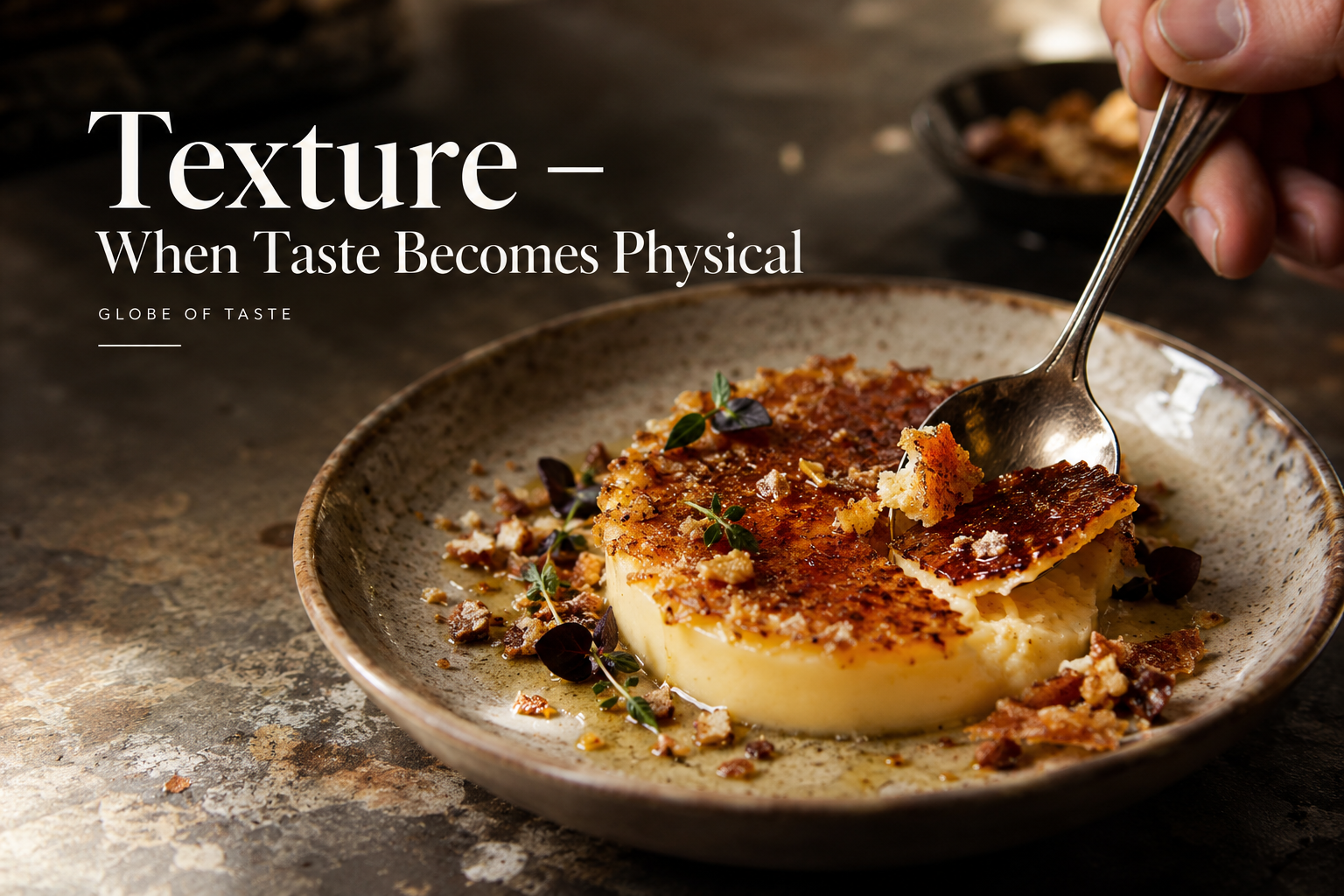
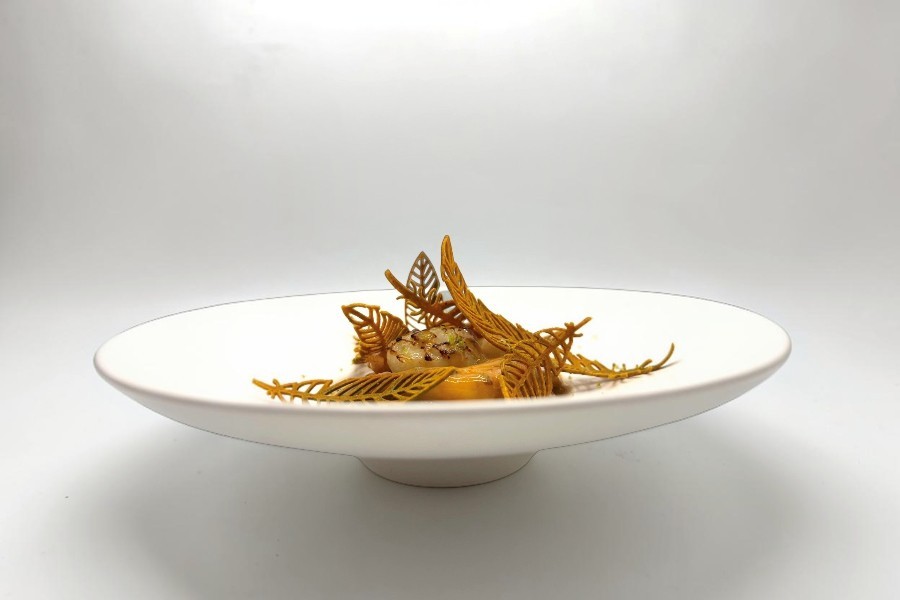
Before this dome of delicately pan-seared scallops—accented by crisp, golden, lace-like tuiles—the eye is instantly transported into the heart of an autumnal atmosphere.
The Autumnal Palette
Shades of ochre, bronze, and amber evoke forest floors, fallen leaves crunching underfoot, and warm, gentle spices. Visually, these rich, inviting tones suggest flavors that are deep, umami-laden, and subtly caramelized.
Brown and golden hues immediately evoke the processes of cooking, roasting, and crisping. In the preparation of a dish, the transformation from raw to golden or brown is the very symbol of metamorphosis brought about by fire and time:
The Mastery of Cooking (the Maillard reaction and caramelization). In the kitchen, browning is the visual hallmark of the creation of flavor. Whether it is a piece of meat seared to perfection, the crust of a loaf of bread, or the caramelization of pan juices, the color brown symbolizes the chemical transformation of food—giving rise to delicious flavors, a satisfying crunch, and toasted notes.
Even before the first bite, these hues evoke intense, warm, and subtly toasted flavors. They also create a striking contrast against the whiteness of a plate, which highlights the food itself and enhances an overall sense of refinement
Each season possesses its own chromatic language, shaping our gustatory expectations:
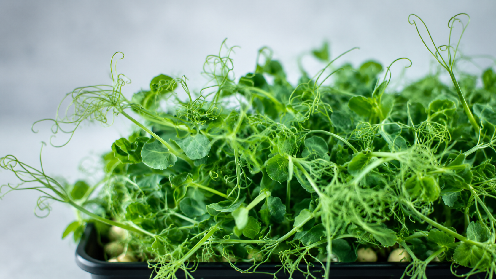
Spring (tender greens and pastel hues): A hymn to rebirth. Chlorophyll-rich green primes the brain to perceive the mild bitterness, crisp freshness, and herbaceous notes of young shoots.
Summer (vibrant reds, sunny yellows, and vivid oranges): These warm, saturated colors stimulate the appetite and immediately evoke the sweetness of sun-drenched fruit, refreshing acidity, and the indulgent pleasures of the season.
Autumn (ochre, brown, burnt orange, and gold): As seen in this sculptural presentation, autumn invites a sense of calm. We naturally associate these colors with flavors of hazelnut, chestnut, forest floor, and roasted, mellow notes.
Winter (pristine whites, deep dark tones, and icy blues): The winter palette relies on contrast. White evokes the purity of an ingredient and a milky, delicate quality, while very dark tones promise intense flavors (truffle, cacao, rich, concentrated reductions).
The influence of colors, volumes, and symbols on taste perception: culinary synesthesia.
On this plate, the tasting experience begins even before the first bite. The presentation plays with colors, volumes, textures, and the symbolism of the elements to shape the diner’s expectations and construct a holistic sensory experience. This can be likened to culinary synesthesia—a phenomenon in which the various senses interact; sight, touch, smell, hearing, and taste complement one another to enrich the perception of a dish. Culinary synesthesia connects all these elements, shaping the tasting experience. Sight anticipates taste: shapes suggest textures, while colors awaken gustatory memories. Brown tones evoke a grilled quality, delicate forms imply crispness, and an airy arrangement suggests lightness. These visual perceptions steer the taster’s expectations even before the food reaches their mouth. When the actual tasting takes place, the sensory experience may confirm, refine, or subvert those initial expectations.